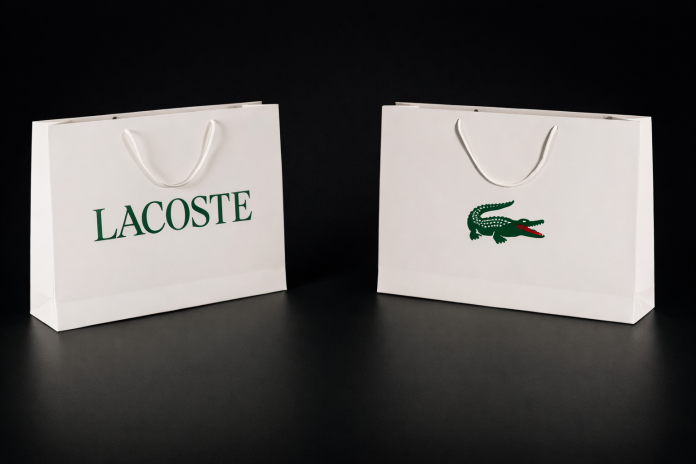
Lacoste has unveiled a refined brand identity that leans into its heritage while enhancing global consistency. Developed in collaboration with Commission Studio, the update introduces archival-inspired serif typography, a more prominent Crocodile logo with a visible red tongue, and a recalibrated version of its signature green closer to original tones.
The redesign extends beyond visuals, incorporating a broader colour palette and heritage-led motifs across packaging and brand touchpoints. This creates a more cohesive and recognisable brand experience, aligning Lacoste’s legacy with modern design expectations.
The move reflects a growing trend among global brands to revisit archival elements and brand history as a way to strengthen authenticity while remaining relevant to contemporary audiences.
By balancing tradition with modernity, Lacoste aims to reinforce its identity across markets while maintaining cultural resonance. Heritage-driven design is becoming a powerful tool for global brand consistency and differentiation.
Bottom line: Lacoste’s refresh shows how evolving core brand assets with a modern lens can strengthen identity, consistency, and long-term relevance.